no-code dev
No toxic conf
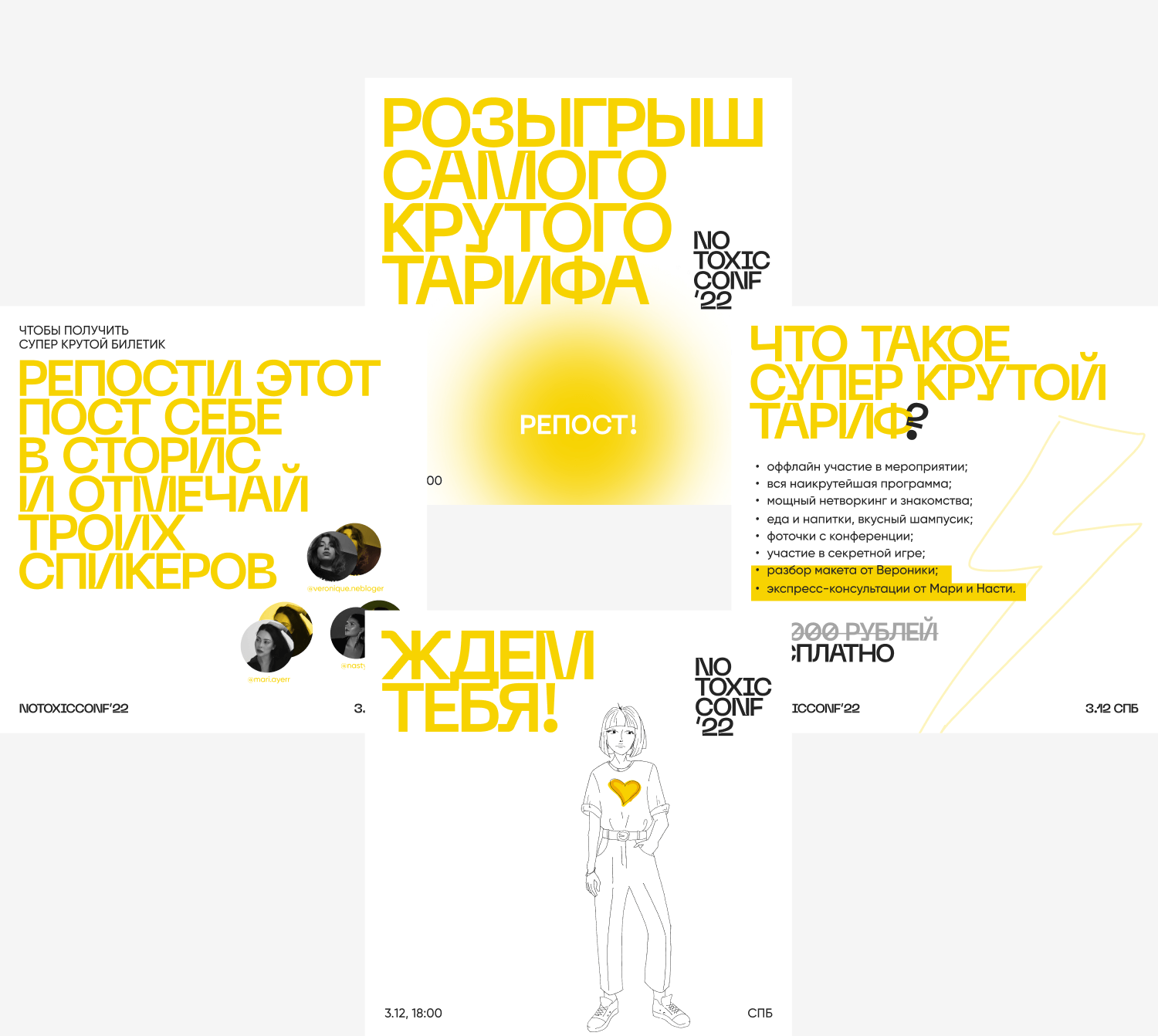
A conference for designers, organized by myself and friends within the design industry, aimed to create a warm, comforting event for those fed up with the toxicity found commonly within the
Illustrations by Nastya Cross
Design and Promotion by Veronica Zubakova & Mari Ayer
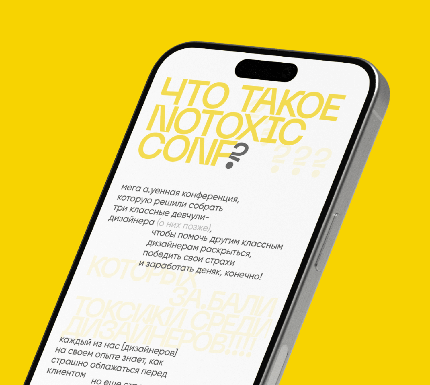
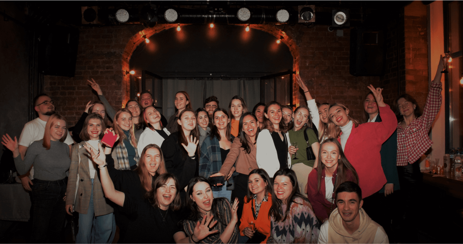
We developed the visuals and identity from scratch, inspired by a female character from a blog of mine, who is a representation of all designers. We built its website, created stickers, and organised the venue. That evening, we brought together over 30 people, enjoying time in the company of like-minded individuals.
- Create a full product in one month.
- Ensure the best user experience that will make customers more engaged.
- Have a conversion rate more than 40% since the major part of audience is loyal.
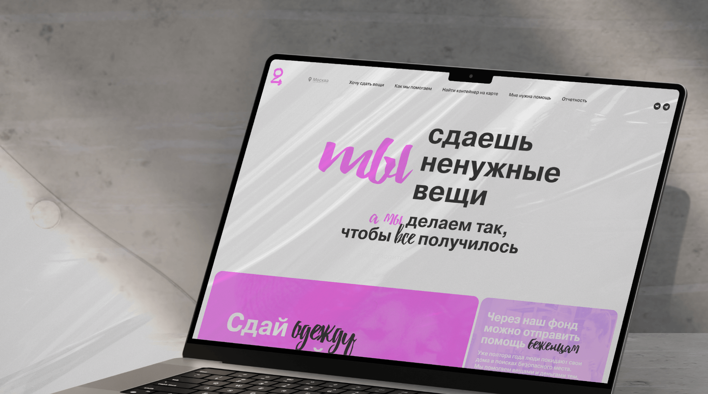
The website’s UI is a reflection of the project’s and founders’ core values—modernity, flamboyancy, and style.
The layout is structured using two grid systems, each tailored to different content types for better clarity and purpose. Strategic color blocking enhances contrast and maintains a dynamic flow.
At the same time the consistent geometric structure guides users intuitively through the page, ensuring seamless navigation to the final call to action.


34
1
4
